How We Built collab.dev: Measuring What Really Matters in Open Source
A few months ago, we launched collab.dev: a public, open-source platform that analyzes how open source projects actually collaborate. This week, it was DevHunt’s Tool of the Week.
This is the story of how it went from a hackathon prototype to a living resource used by hundreds of developers and maintainers - and what we learned about measuring what truly matters.
Why We Built It
At PullFlow, we build tools that help developers work better together - through GitHub, Slack, and VS Code integrations. But over time, we kept running into the same question:
“How do we measure collaboration in the first place?”
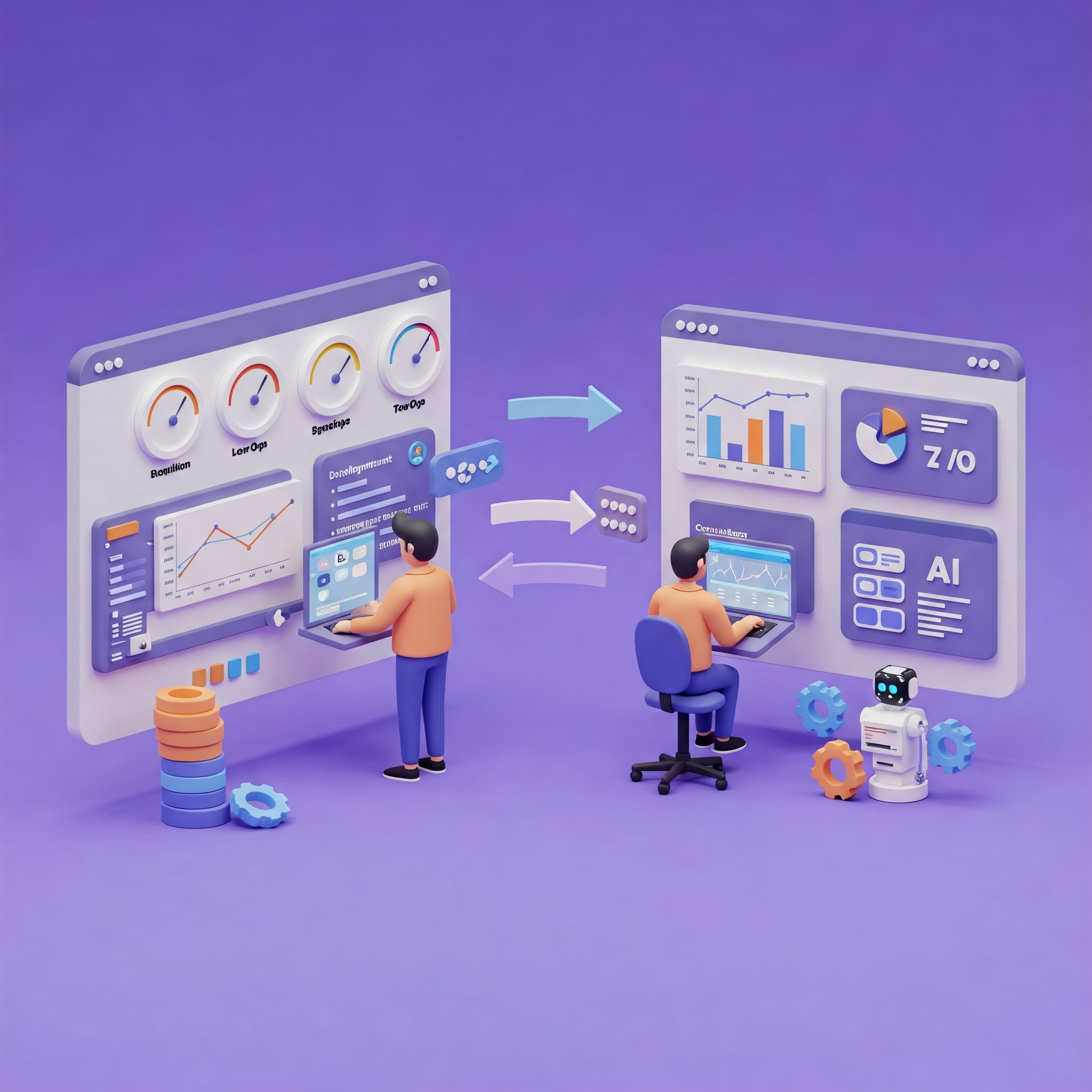
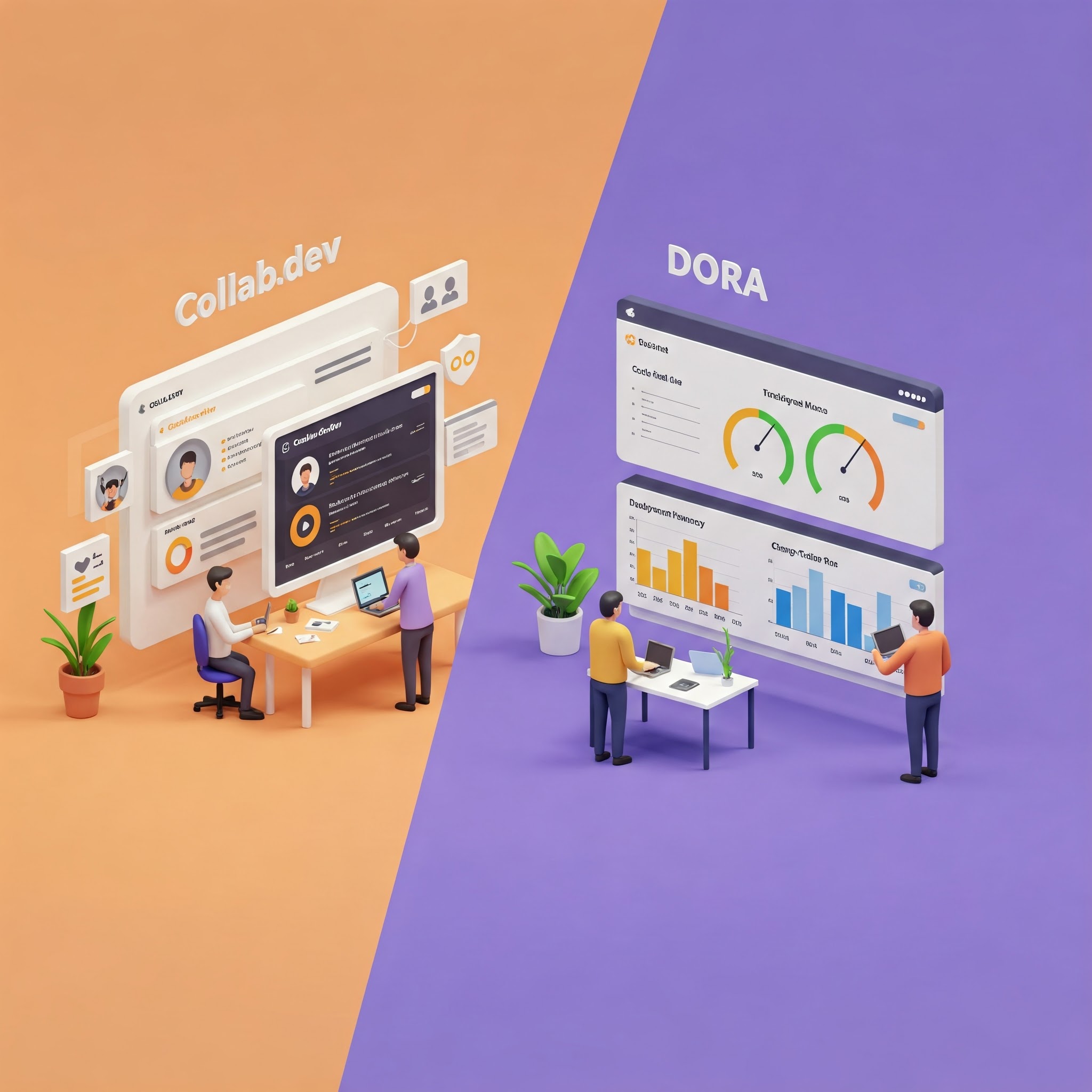
DORA metrics are the closest thing the industry has. But they focus on deployment speed - not whether teams were actually working well together. Meanwhile, teams could feel when collaboration was broken (frustration, bottlenecks, silent PRs) but had no way to quantify or diagnose it.
We knew there had to be better metrics. Metrics that revealed things like:
- Wait time - how long developers are stuck waiting for others
- Review flow - how work moves (or gets stuck) through the system
- Contributor patterns - how core teams, community members, and bots interact
So, we set out to build something that could capture these ideas.
The Hackathon That Started It All
The real momentum came during an internal hackathon, when our teammates from Australia were visiting.
Amna Anwar and I teamed up to prototype a tool we called Pulse - meant to give a quick “pulse check” on how collaboration was flowing within a project. We started with internal PullFlow data, but quickly realized: if we wanted generalizable metrics, we needed to look at the broader open source ecosystem.
So, we grabbed PR data from 100 popular GitHub projects across the JavaScript/TypeScript ecosystem.
First Attempt: The Collaboration Report Card
We built out a “report card system” - a Next.js app that analyzed repositories and assigned them letter grades and detailed rubrics. It looked polished. It felt comprehensive.
But when we were showing it around during our team retreat to Lake Tahoe, people kept asking the same question: “Okay, but what does this actually mean?”
A B+ grade didn’t tell them whether React’s process would work for their team. An A- didn’t explain why Vue handled contributions differently. We were stumped and honestly getting a bit frustrated.
Then our PMM said something like, “This feels like you’re trying to grade my high school essay instead of helping me understand how these teams actually work.”
The feedback hit hard: We were trying to judge these projects instead of understand them.
The whole approach was wrong. These projects weren’t broken and didn’t need our grades. They had evolved different collaboration patterns for good reasons. Our job was to help people see and learn from those patterns, not rank them.
Discovering Patterns Through Visualizations
So we ditched the grades and started visualizing the raw data instead.
Using Preset, we explored:
- PR funnel shapes
- Time distributions (review time, approval time, merge delay)
- Contributor activity by type (core, community, bots)
The patterns became obvious once we could see them: different projects had different shapes. Some had tight feedback loops. Others had multi-stage review processes. Some were mostly automated with bots, others were entirely human-driven.
There was no single “right way” - but visualizing the process helped us see each project’s unique collaboration fingerprint.
MVP in Streamlit
To validate the concept, we built a quick MVP in Streamlit.
Every repo got its own page with interactive graphs, metrics, and contributor breakdowns. You could search any of the 100+ repos we had analyzed and instantly see how collaboration flowed.
We got feedback from teammates and external developers and kept refining the metrics and visual choices. We even wrote a methodology doc to explain how we were defining each metric.
But Streamlit, while great for prototyping, quickly hit its limits.
Rebuilding in Flask
So we rebuilt the whole project in Flask.
Over the course of a week, we went from prototype to deployed production app - complete with search, caching, improved visualizations, and GitHub login. Users could:
- Add any public GitHub repo
- See detailed collaboration metrics
- Explore contributor dynamics and PR lifecycle patterns
- Favorite and track repos over time
Adding a Maintainer Experience
As usage grew, maintainers started asking for more targeted insights into their own repos. So we built a maintainer dashboard, allowing them to:
- View deeper breakdowns specific to their repo
- Monitor changes in collaboration patterns
- Get early access to experimental metrics and visualizations
This was a turning point - from a public exploration tool to something maintainers could use for real, ongoing insight.
Going Open Source
Eventually, we had to confront the irony: we were analyzing open source collaboration… in a closed-source tool.
So we extracted and open-sourced the core visualization engine. Now, anyone can contribute new metrics, fork the project, or run their own local version of Collab.dev.
Launch and Response
We launched with about 250 pre-analyzed repos. Since then:
- Users have added 100+ more
- We hit Product of the Week on DevHunt
- We started a weekly newsletter breaking down different projects’ collaboration patterns
- And maintainers have been signing up to track their own repos
It’s been exciting to see the community pick it up and start asking great questions about their own workflows.
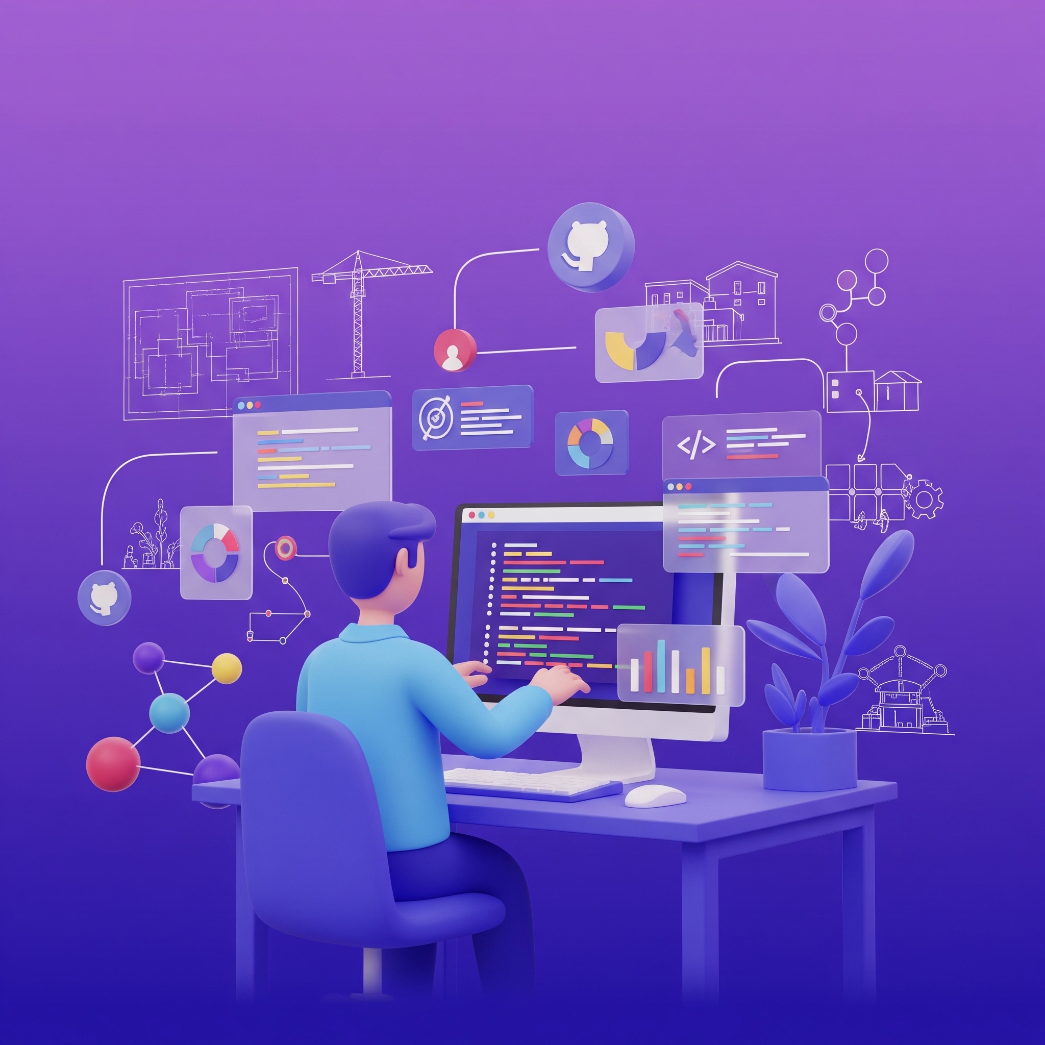
Technical Stack
Here’s what’s under the hood:
- Backend: Flask + PostgreSQL + Valkey (Redis-compatible cache)
- Frontend: Jinja2 + Tailwind CSS + vanilla JS + Chart.js
- Data collection: GitHub API (with background jobs and rate limit handling)
- Prototyping tools: Streamlit and Preset
- Deployment: Dockerized app on AWS Lightsail
- Dev tools: PDM (Python dependency management), GitHub Actions for CI/CD
- Open Source: Core metrics + visualization engine in a separate open repo
What’s Next
We’re just getting started. On the roadmap:
- Support for Python, Go, and Rust projects
- Historical trend tracking
- Private repo analysis
- AI-powered summaries
- Smarter multi-repo comparisons
And more feedback-driven improvements as maintainers continue using the tool.
Try It Yourself
Want to see how your favorite project collaborates?
- 👉 Visit collab.dev
- 🔍 Search for a repo or add your own
- 📈 Explore your team’s collaboration metrics
We’re also publishing a Project of the Week series on Dev.to and sending out insights via our newsletter.
Final Thought
We built collab.dev because we needed better ways to understand how collaboration actually works - and where it breaks down.
It’s still evolving, but the response so far has made it clear there’s a real need for these kinds of metrics and visualizations.
If you’re curious, give it a try. And if you have thoughts, ideas, or want to contribute - we’re always open to feedback.